
A dashboard is a saved arrangement of answered questions. You pick the questions, place them and size them; the tile decides what form its answer takes in the room you gave it. Reading has no handles — arranging is a mode you enter on purpose and leave when you are done.
Boards
A custom marketing dashboard starts from a template rather than from an empty grid — a company with no board yet is offered a starting one, and you rearrange from there. A selector at the top names the board you are looking at and how many questions it answers, because the questions a board answers are its placements; there is no second list to keep in step.
Boards can be closed, the default included. Closing one never leaves the next choice to chance: the seat passes to the oldest board that remains, so a company always has a default as long as it has any board at all.
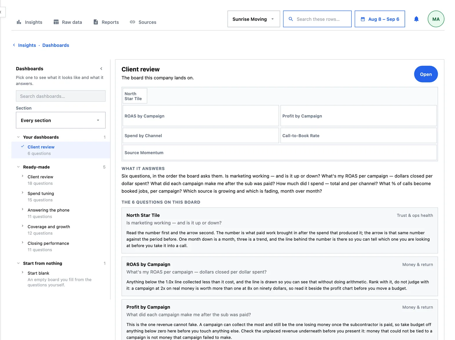
Adding a question
Questions come from the catalogue pane docked to the left of the board, grouped by topic. Press a question and its answer lands on the board; press it again and it comes off. A question whose source is not connected is still listed, with a note saying what it is waiting on.
You choose which answers are present, where they sit and how big they are. What is drawn by default is the product's decision — though a widget's own menu offers the chart forms its data shape can honestly take, and that choice is saved on the placement like a size.
Arranging, and what a drag feels like
Arrange grows a drag surface and a size control on every widget. Done writes the whole board in one go, and Discard puts it back exactly as the server last saw it — so a drag that goes wrong costs nothing.
The drag itself follows four rules, and they are the same four everywhere something is dragged in this product:
- The thing you are holding tracks your pointer exactly. No easing, no lag, no animated catch-up.
- The snap is instant. A cell is either the target or it is not; an animated settle would mean the board and your hand disagreed for a moment.
- Only a ghost moves mid-drag. The neighbours hold still, so the board does not reflow under the tile you are aiming at.
- The cascade resolves once, on release. Anything that has to move yields downward, and it moves after you let go.
A size is a form, not a floor
Most dashboard products give a chart a minimum size and refuse anything smaller. This one does the opposite: a renderer declares a ladder of forms, the tile measures the room it actually has, and it draws the richest form that fits.
| Room | What the answer becomes |
|---|---|
| Very small | The figure itself, sized to the box |
| Narrow | Bars with the name and the value riding on the row |
| Medium | A label column, the bar, and a value column |
| Wide | The same, plus the sentence that answers the question |
| Very wide | The rows fold into two columns rather than stretching |
The consequences are worth stating, because they are what makes a small tile useful rather than merely small:
- The rows fill the tile. The spacing between bars is a small capped constant and the bar itself is the remainder, so a taller tile means thicker bars rather than a stack of rows with white space underneath.
- How many rows are shown is measured, not fixed. A tile shows what fits legibly.
- A list with room for one row prints the total instead. One bar out of seven is not a smaller answer, it is a wrong one.
- The smallest legal width is a property of the answer. A money widget cannot be narrower than its own figure printed with its cents — money always prints its cents here.
What a widget prints
The head carries the question, at reading weight. The category is a small tick beside it and a faint watermark over the marks, never a band that eats the tile — eight widgets each spending thirty-five pixels on a category label is two grid rows of a screen spent saying nothing.
Two rules govern what the picture may do:
- Five categories, then Other. A ranked list names five and folds the rest into an Other row on the floor of the tile, printing its own sum and count, opening onto its members. A rate cannot be summed, so its Other counts instead — “12 more campaigns”. Time axes, tables and the bench grid are the exceptions, because a month is not a category.
- A bar needs a ruler. A chart's scale ends at the data rather than at a rounded number pulled from nowhere, and a rate is not pinned to 100 just because it is a percentage.
A widget with nothing to say
An empty tile draws its own anatomy, ghosted, with the reason at the foot. It does not print a zero, and it does not demand a connection you have already made: a connected ad account with no spend in the window is an answer — “no campaign spent over the last 31 days” — and the widget says that instead.
Opening a question in full
Pressing a widget opens that question as its own page: the chart over a longer horizon, the table it was drawn from, the definition of the metric behind it, and the rows folded in underneath. A tile is what you keep on screen; the page is where you go when somebody asks you to defend the number.
Hovering a mark shows the full name and a small panel of evidence. The panel opens against the direction your pointer is travelling, so it does not land under your own cursor, and a group of related marks emphasises together rather than flickering as the pointer crosses them.