
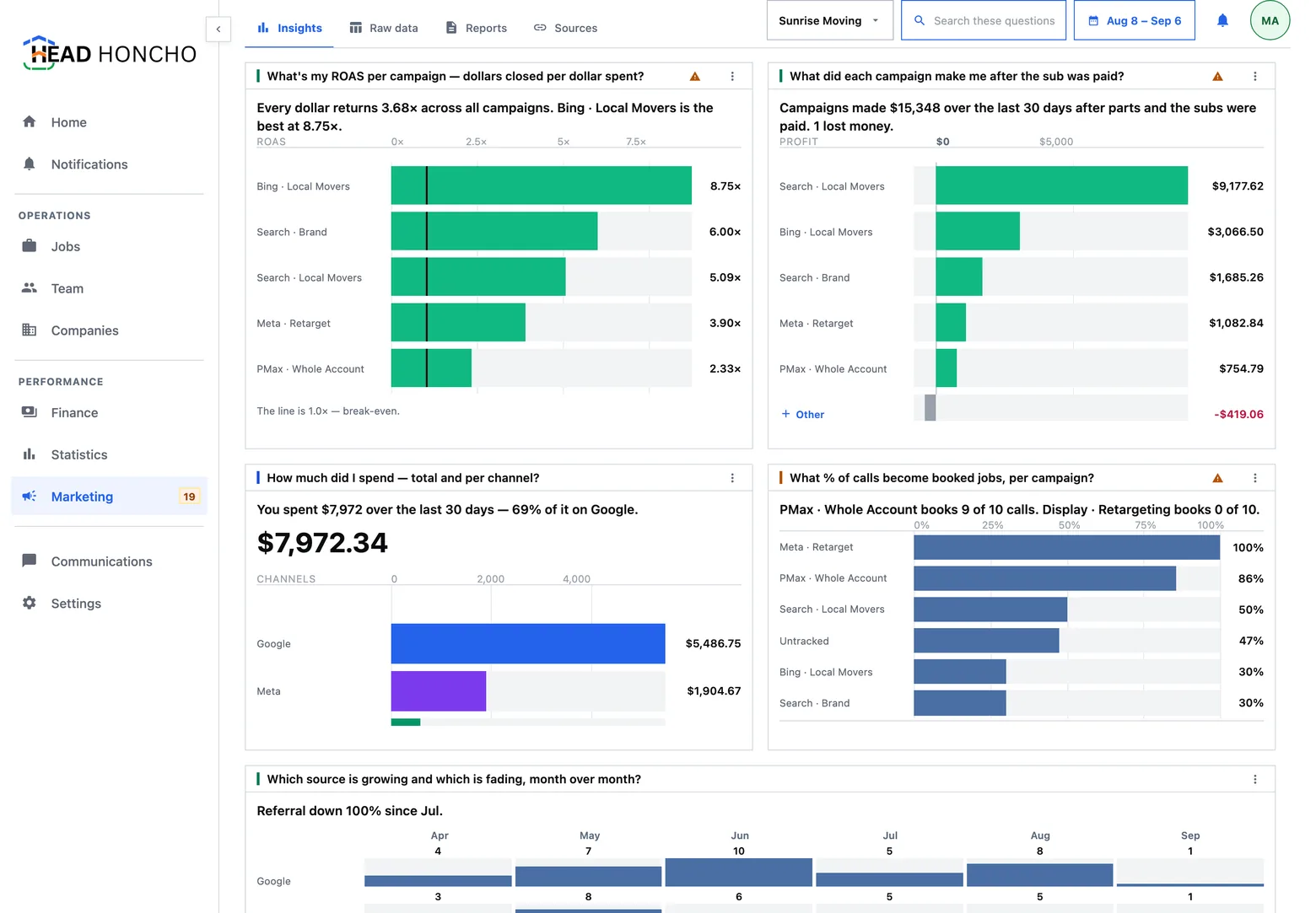
Marketing has four boards — Insights, Raw data, Reports and Sources — and Insights is the one you land on. It is a board of answered questions, and above it a bar that says what the panel can and cannot see from the sources you have connected.
What the panel can see
Three things have to arrive before a spend-to-profit answer exists, and the panel names them in plain words rather than in jargon:
- What you spent — from the ad platform.
- What it produced — from the call tracker or lead source.
- What it was worth — from the jobs and the money in this product.
The notice above the board says which of the three are in, and asks for the one connection that would widen what it can answer. It is not a ladder: a workspace holding the second and third but not the first is not graded as a workspace holding nothing. It has a different set, so it can answer different questions, and the notice says which.
A connected ad account with no campaigns is an answer of zero, and the widget says so in its own words — “No campaign spent over the last 31 days” — rather than demanding a connection you have already made. Every question in the catalogue has to report honestly on an empty range.
Coverage is never hidden
A click ID goes missing far more often than anyone expects: blocked scripts, cached pages, a number off the side of a van, a call arriving through a business profile. That means a share of your calls can never be traced to a campaign, no matter how good the plumbing is.
So coverage is printed on the surface rather than in a footnote. An operator who is not shown that a third of calls carry no click ID reads the product as broken; an operator who is shown it reads the channel as leaky, which is the truth and is also the thing they can act on. The rule the panel follows: the explanation behind a number may be tucked away, the limit on one may not.
The same honesty applies to money that cannot be placed. A click ID proves which network a click came from and never which campaign, so revenue the product cannot attribute to a campaign is stated on the chart in dollars rather than quietly dropped. A campaign chart that loses part of the revenue without saying so is exactly the confident lie this panel exists to refuse.
Your own board
A marketing dashboard home services businesses will actually read is one they arranged themselves, so a board here is yours: a company with no board yet is offered a starting template, and from there you add the questions you care about, place them, and size them. Nothing re-sorts itself under you.
Three rules hold the board together:
- One date lens rules every widget. There is no per-widget date picker, because two widgets showing different periods on one screen is a lying board.
- The title is the question and the headline is the answer — computed on the server, so the sentence and the chart cannot disagree.
- Five categories, then Other. A list of campaigns names five and folds the rest into an Other row you can open. A board cannot grow a chart with forty bars just because the account grew.
Insights is a board about one client at a time. Ad credentials belong to one company — an agency running seventeen clients holds seventeen grants — so the panel's own company selector decides whose numbers are on screen. See managing multiple companies.
How boards, tiles and sizes actually behave is one page over: dashboards and widgets.
Choosing the questions
The question catalogue opens as a pane docked to the left of the board, grouped by topic — money and return, campaign tuning, geography and timing, calls and the connector, booking and the funnel, closers and techs, planning and forecasting, trust and ops health. Each topic folds with its count, and the search matches the topic, the question and the note under it.
A question whose source is not connected is still listed, with a note saying what it is waiting on, and a Show menu switches between all questions, the ones ready now, the ones waiting on a source, and the ones already on your board. Pressing a question puts its answer on the board; pressing it again takes it off.
A question is a choice; a chart is not — you pick what is asked, and the default drawing of each answer is the product's. What you can change is which answers are present, where they sit and how big they are.
Pressing an answer
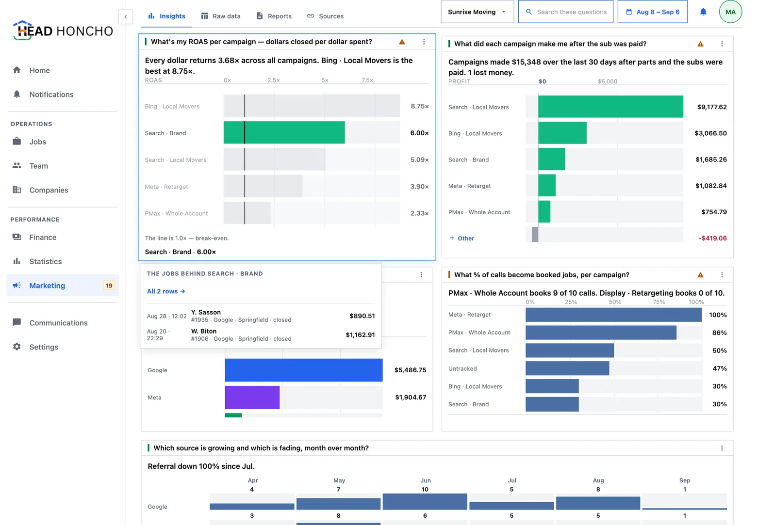
Pressing a widget opens that question as a page of its own: the chart over a longer horizon, the table it was drawn from, the definition of the metric behind it, and the raw rows folded in underneath. It is the difference between a dashboard you look at and a number you can defend in a client meeting.
The review queue
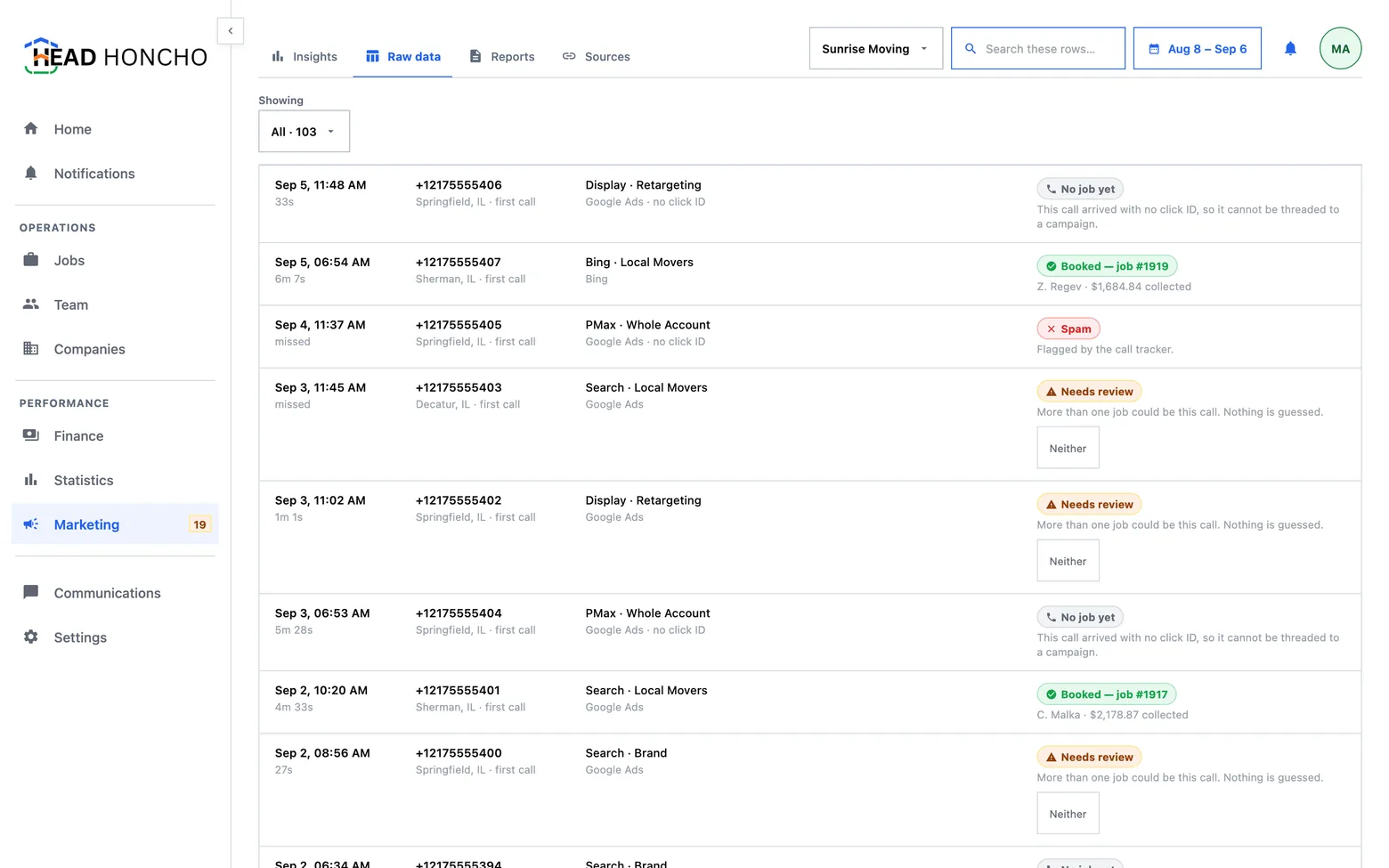
When a tracked call could plausibly belong to two jobs, the product does not pick one. The row goes to Needs review, stays out of the conversion file, and waits for a person — and the notice above the board says what the number means, because a badge reading “4” beside a tab tells nobody that four conversions are sitting out of the file until somebody chooses.
Opening it lands on the leads list already filtered to the queue. A queue that opens unfiltered is a queue nobody drains.
Three things this panel refuses to do
- It never hides coverage. See above.
- It never resolves an ambiguity for you. Two candidate jobs wait for a human, with the buttons on the row.
- It never exports a matched job at zero. A job that has collected nothing yet is held back, with the reason on the row. A zero-value conversion tells the ad platform the click was worthless, which is a far stronger claim than “we have not been paid yet”.
There is a fourth, worth knowing if you ever see rehearsal figures: when the panel is running on a practice data feed it says so across the top, every time.
Where the other three boards fit
If you are still weighing whether the closed loop is worth building, how HeadHoncho works is the same story in six steps.