
Every figure here is an aggregate computed when you ask for it, over the same rows Finance and Jobs read. There is no separate statistics store, which is why this panel and Finance cannot report different money for the same dates.
The figures
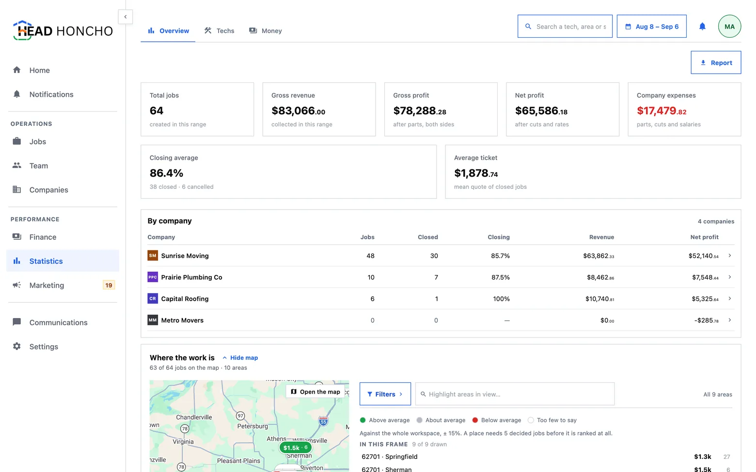
The job profit dashboard opens on a row of figures for the range you chose. Each one is owned by a single definition used everywhere it appears, rather than restated here.
| Figure | What it counts |
|---|---|
| Total jobs | Jobs created in the range |
| Revenue | What clients paid, gross |
| Gross profit | Revenue less all parts, whoever paid for them |
| Net profit | Gross profit less the cuts and rates that pay for labour |
| Company expenses | Expenses and payable ledger rows, counted once — reimbursements excluded, because the expense was already recognised |
| Closing average | Closed divided by closed plus canceled. Open jobs are in neither term |
| Average ticket | The mean price of jobs closed in the range |
Net profit alone reads as the whole margin, and it leaves the base that every subcontractor cut is a percentage of off the panel entirely. Both rungs are shown so the arithmetic between them is visible: a cut is subtracted once and only once — the expense total already contains it, because labour exists nowhere else.
Two windows, on purpose
A job and a dollar disagree about what “in this range” means, so the panel uses two axes and says so on screen rather than leaving you to guess which one is in force:
- Job-shaped figures — total jobs, the closing average, the average ticket, every chart — are windowed on when the job was booked.
- Money-shaped figures — profit, expenses — are windowed on when the money moved.
One axis for both would either drop a payment collected after its job's range, or drop every job that has not been paid yet. Neither is a smaller error than saying which axis you used.
The charts
Under the figures sit the charts: where the jobs came from, the closing rate and the average ticket per worker, jobs by area, cancellations per worker, where the money went, and what is owed. Three properties are built into the marks rather than left to whoever placed them:
- A colour follows the thing, never its rank. A source's colour is its position in your whole source vocabulary, so narrowing to a week cannot move one source onto another's hue.
- Every slice, bar and column carries its own number and label, so a chart survives being read in greyscale or printed badly.
- Cancellations are coloured by rate, not by rank. Amber past one in ten of that worker's own jobs, red past one in five. Painting the tallest bar red would mean “worst in this filter”, which changes every time somebody moves the date range.
The balances card carries two stamps a balance always needs: it is as of today rather than for the range, and it is workspace-wide, because settlements and salaries do not belong to a single company and cannot honestly be narrowed to one.
Per worker, not per share
A job with a lead and a helper counts once for each of them. The per-worker charts therefore do not add up to the total, and the panel says so on screen: how does this person do is a different question from what share of the month was theirs. Splitting the credit would make a two-person job worth half a close each — a claim about performance that nobody actually made.
Two consequences follow:
- A worker with nothing decided has no closing rate and is absent from that chart, rather than drawn at zero. “Has not finished a job yet” must not render as “loses every job”.
- A worker with no cancellations is drawn, because who cancels is only readable against who does not.
Five categories, then Other
No chart names more than five categories. The rest fold into one Other row that carries the rows it stands for and opens onto them when you press its name tag.
What Other does with the numbers depends on what they are: a count or an amount sums into its bar, while a rate or an average counts instead — “2 more techs” — because the average of a set of closing rates is not a closing rate. The panel's search reaches the rows behind Other, and the CSV export prints the Other row and then every member it stands for, marked as such, so a spreadsheet cannot imply a completeness the screen never claimed.
Several clients at once
With more than one company in scope the figures are the sum over them — and directly under the tiles sits a By company table, one row per client, each figure re-derived for that client rather than apportioned from the roll-up. A sum with no parts is a number nobody can check.
Two rules that table keeps:
- Every company in scope gets a row, including the empty ones. A client whose phone did not ring produces no data, and a table built from the data would drop them — printing silence as absence. Zero is the finding.
- It does not fold. Five-then-Other is a rule about categories, and a company is a client with a contract. “Other: 12 companies” is the one answer an account manager cannot act on, so the table scrolls instead.
A row is a door: pressing it narrows the whole app to that client. See managing multiple companies.
What a zero is never allowed to mean
A figure with nothing behind it is not printed as 0. A
closing rate over no decided jobs, a chart with no rows, a rate with no
denominator — each says what is missing instead. A zero is a claim about
the world, and a claim nobody measured is the fastest way for a dashboard
to stop being believed.
The Report action exports the range as a CSV that carries the same numbers the charts drew, one section per chart. On several clients, the by-company split is the file's first section — a roll-up handed to a client with no per-client split is the one export an agency cannot use.