
There is one codebase and one product. The phone app is not a wrapper around the website and not a cut-down companion: the same screens, the same data, the same login, drawn for a phone.
One product, two shapes
The field service mobile app is built from the same source as the browser app, which has a consequence worth stating plainly: a feature does not have to be ported. When a rule changes — how a cut is derived, what needs you, what a status means — it changes in both places at once, because there is only one of it.
Install it from the app section on the homepage, on either store. It is included on every plan, with unlimited seats, so every technician can have one.
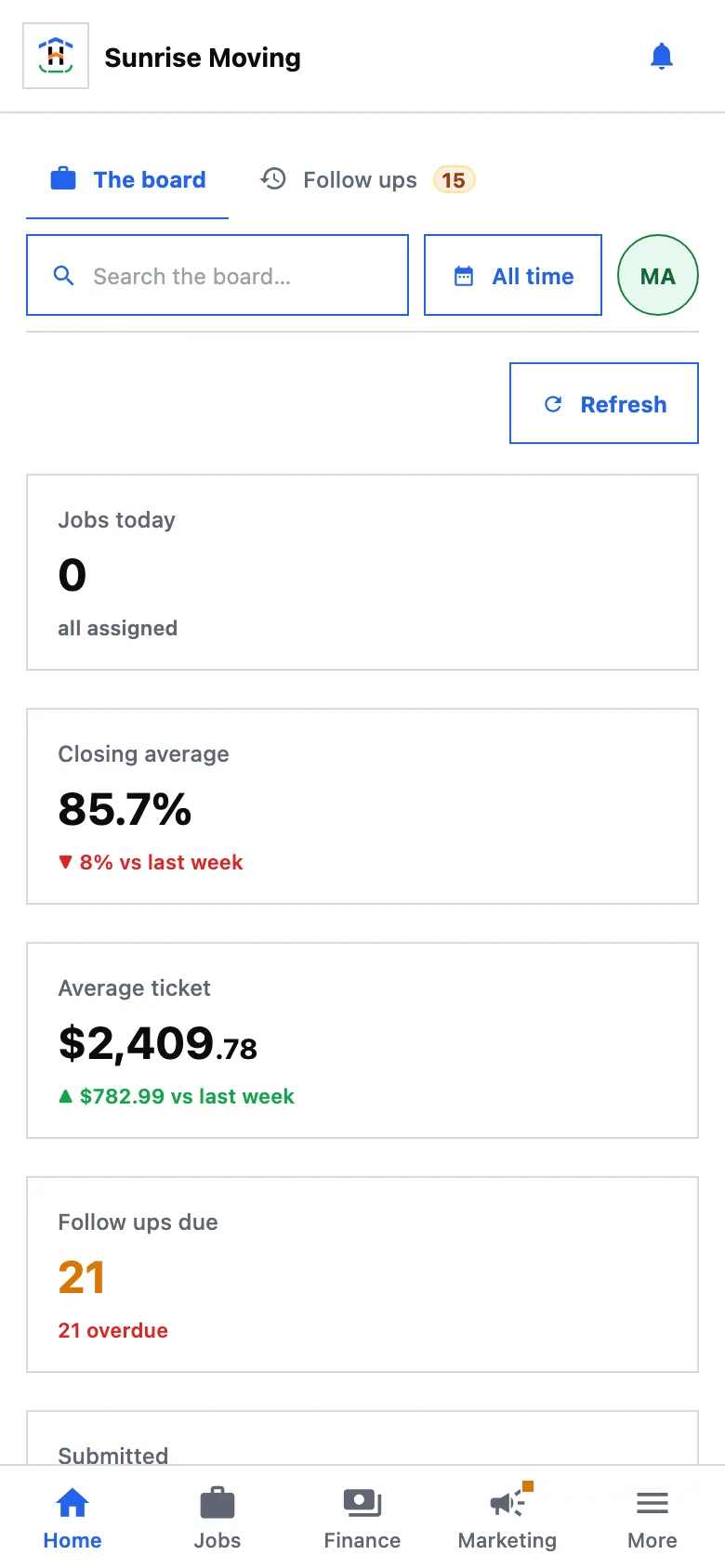
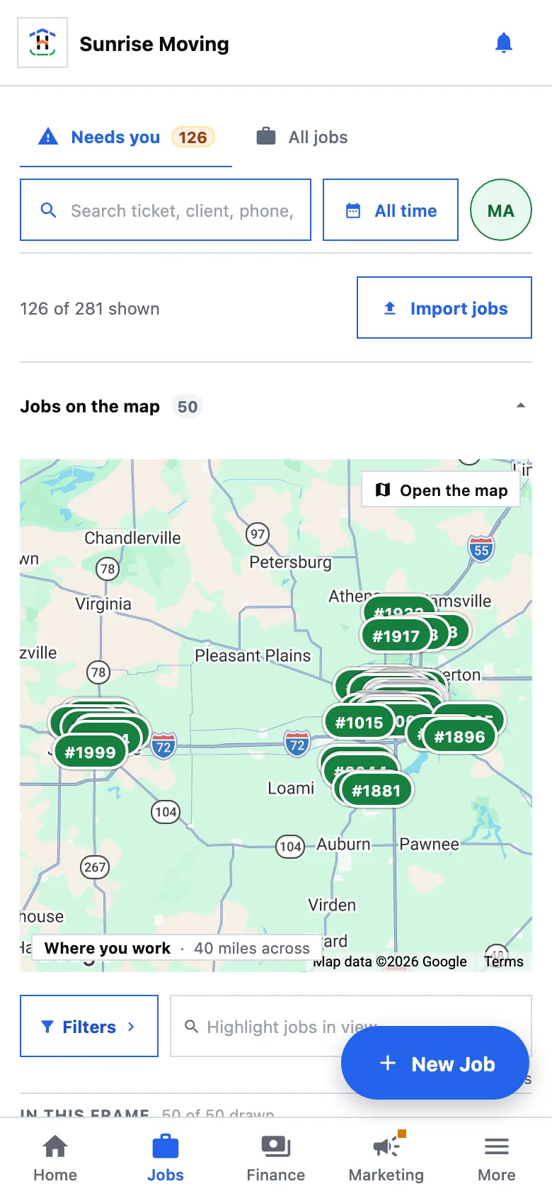
Signing in on another device
Sign in with the same email and password you use in the browser. Sessions are per device, so signing in on a phone does not sign anybody out anywhere else, and signing out of the phone leaves your desk untouched.
A worker who does not have a login does not get one by being on the roster — see what a worker cannot do. People who sign in are members, and members are invited in Settings.
Push, and who decides
The app never asks for notification permission at first launch. The ask sits behind a sentence explaining what it is for — on Home, and as a switch in Settings — because a permission prompt in the first three seconds of an install is a prompt people decline on principle.
- Each device answers for itself. What this phone is told about is this phone's setting; your other devices keep their own.
- You are never told what you just did. The device that performed an action is left out of that action's notification.
- What can reach you is one catalogue, shared with the bell in the app, so the phone and the browser cannot word the same event differently. See notifications.
- If you decline, the only door left is the operating system's own settings — the prompt is a one-shot — and the app says so and offers to open them rather than asking again in a way it cannot.
A link opens the record
A link to a job in a text message, an email or a notification is one address, and on a phone with the app installed it is the app that answers it. A tap on a notification, a link a colleague sent, and the address bar in a browser all land on the same screen for the same string, because there is one parser behind all three.
An address that means nothing lands on Home rather than on a blank screen.
What is phone-shaped, and what is not
| Better on a phone | Better on a screen |
|---|---|
| The job: address, window, price, status, and the crew | Arranging a dashboard — a twelve-column drag grid needs a desk |
| Assigning and moving a job along from the driveway | Wide tables with many columns, which scroll sideways on a phone |
| Logging money where it happens | The reports catalogue and anything you are about to send a client |
| Photos on the job | Setup: connecting sources, editing templates, writing rules |
Where a control genuinely does not fit, the app says so rather than shrinking it into something unusable. On a narrow screen the column menu on a table is out of reach and the panel's own filters are the door; the table itself scrolls sideways with everything still on it.
Refreshing
A browser tab has three ways to reload and an installed app has none, so pull down to refresh works on every panel. It re-runs that panel's own read with today's filters, range and page — not a reboot of the app — and it always refreshes the session underneath, which is what brings back anything the workspace changed while you were out.
How updates arrive
Some changes reach the app over the air: open it, and the newer version is there. Changes that touch the native shell — a new permission, a new device capability — need a new build from the store, like any other app.
Which of the two a given change needs is decided by what actually changed rather than by a schedule, so most work reaches a crew's phone without anybody visiting a store page.